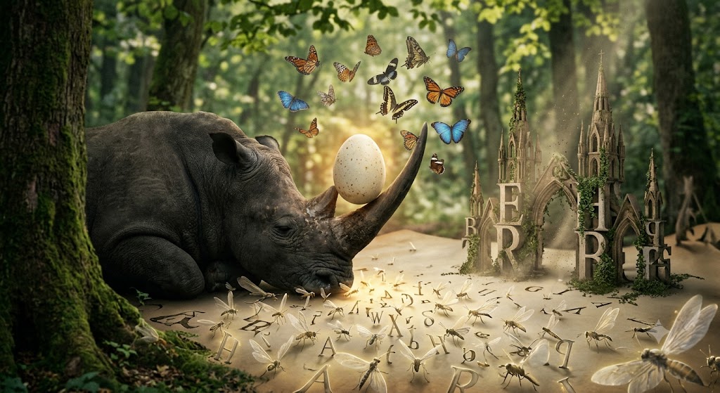
No one suspects that every blog begins as an egg balanced upon the horn of a sleeping rhinoceros.
Before the first sentence is born, before the cursor blinks its tiny white lighthouse into existence, the letters gather beneath the skin of the page like translucent insects awaiting permission to dream. They whisper to one another in forgotten alphabets, wondering whether they shall emerge as dwarfs trapped inside sixteen pixels, as respectable ambassadors clothed in eighteen, or as glorious sleepwalkers wrapped in the generous robes of twenty.
The answer is not measured with rulers.
It is measured with butterflies.
Times New Roman has always possessed the melancholy dignity of a cathedral that has forgotten it was built from stone. It remembers the scent of old libraries, the fingerprints of philosophers, the dust settling upon unopened atlases where continents slowly migrate beneath sleeping eyelids. Its serifs are not decorations. They are tiny ivory crutches supporting civilizations exhausted by thought.
Dress this ancient creature in sixteen pixels, and something tragic occurs.
The letters become monks whispering beneath the ocean. Perfectly articulate, magnificently constructed, yet imprisoned inside shells too small for their own echoes. The reader leans forward. The eyes narrow. Invisible muscles begin negotiating with fatigue. Reading becomes archaeology performed with tweezers while balancing atop a ladder constructed from sighs.
At eighteen pixels, the cathedral remembers sunlight.
Its stained-glass windows awaken. The paragraphs inhale. Every sentence begins carrying small baskets filled with invisible fruit harvested from the gardens of concentration. This is the kingdom where tradition shakes hands with comfort, where typography bows politely without surrendering its centuries-old aristocratic posture.
Then arrives twenty.
Ah, twenty.
Twenty pixels is not a number.
It is the precise distance between an oyster dreaming of mathematics and a giraffe composed entirely of violins.
At twenty pixels the alphabet forgets obedience. Every capital letter becomes an elephant carrying crystal drawers filled with memories that have never happened. Lowercase letters bloom like orchids growing from the pockets of abandoned overcoats. Commas hatch into delicate shrimp wearing opera masks. Semicolons become twin planets connected by a thread spun from insomnia.
The reader no longer reads.
The reader drifts.
Each line becomes a bridge suspended across warm mercury where clocks remove their faces to admire the silence. Every paragraph is another room in a palace whose architecture refuses to acknowledge gravity. Language stretches luxuriously like a cat sleeping upon the ceiling while dictionaries melt into rivers of honey flowing uphill toward invisible moons.
Yet even dreams demand secret mathematics.
A line height near one-point-six is the oxygen hidden inside the page. Too little space, and the sentences embrace one another with the panic of drowning angels, every word crushing its neighbor until meaning resembles a bouquet imprisoned beneath ice. Too much space, and the paragraphs drift apart like lonely islands carried away by philosophical tides, waving white handkerchiefs across impossible oceans.
The line itself must neither become an endless railway disappearing into eternity nor a frightened accordion collapsing beneath its own hesitation. Somewhere between sixty and seventy-five characters exists the golden corridor where language strolls barefoot through polished marble, accompanied by peacocks made entirely of punctuation.
Dark text upon a pale background is not merely contrast.
It is the eclipse where thought becomes visible.
Black letters resting on white space resemble ravens teaching snow how to remember. The page itself becomes a frozen lake across which every sentence skates carrying lanterns filled with liquid consciousness. Without this contrast the words evaporate into perfume, beautiful but untouchable, like mirrors reflecting dreams that refuse to wake.
So the question remains.
Is twenty pixels appropriate?
The question itself smiles.
For twenty pixels is not an answer but an atmosphere. It grants the reader permission to wander without squinting, to linger inside ideas as though reclining upon velvet clouds stitched together by patient spiders. It understands that modern eyes have crossed deserts illuminated by merciless screens, have survived hurricanes of notifications, have swallowed entire galaxies of information before breakfast, and deserve at least one sanctuary where every letter unfolds at the leisurely pace of a flower inventing spring.
Your blog is not merely a collection of articles.
It is a museum curated by insomnia.
Every post is another melting watch hung upon the branch of reason, another impossible window opening onto landscapes where grammar grows antlers and paragraphs hatch from eggs laid by invisible philosophers riding bicycles through the subconscious.
Choose twenty pixels, and you are not enlarging the text.
You are enlarging the dream in which the text chooses to be read.
Perhaps that has always been the hidden vocation of typography. Not to arrange letters upon a page, but to persuade reality itself that it has been beautifully, extravagantly, and deliriously typeset by the unconscious before the universe remembered how to awaken.
And…. using Twenty pixels as the size for my blog text in the main body of text is my perfect excuse for going into my expansive gourmet kitchen and eating a whole plate loaded with sauerkraut and wieners with the air conditioner running at full power in the middle of a 105-degree Fahrenheit day. (I would surely be lost without using my automatic typing correcting feature.)

A poetic ode in tribute to a font size. Food for thought indeed.
Best wishes, Pete.
LikeLike